-

- News
- Books
Featured Books
- pcb007 Magazine
Latest Issues
Current Issue
Engineering Economics
The real cost to manufacture a PCB encompasses everything that goes into making the product: the materials and other value-added supplies, machine and personnel costs, and most importantly, your quality. A hard look at real costs seems wholly appropriate.

Alternate Metallization Processes
Traditional electroless copper and electroless copper immersion gold have been primary PCB plating methods for decades. But alternative plating metals and processes have been introduced over the past few years as miniaturization and advanced packaging continue to develop.

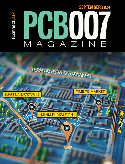
Technology Roadmaps
In this issue of PCB007 Magazine, we discuss technology roadmaps and what they mean for our businesses, providing context to the all-important question: What is my company’s technology roadmap?
- Articles
- Columns
Search Console
- Links
- Media kit
||| MENU - pcb007 Magazine
Estimated reading time: 3 minutes
It's Only Common Sense: Don't Make Me Think
 Editor's Note: To listen to Dan's weekly column, as you've always done in the past, click here. For the written transcript, keep reading...No matter what kind of marketing you do--print advertising, social media marketing--the cornerstone of such efforts will be your website. In the end, the goal is to get people to visit your website. Almost all of the time, money, and effort you spend on sales, marketing, and branding is to get people to make that click. What they find there will often determine whether or not they do business with you.
That site of yours better be attractive, interesting, informative, and easy to navigate. That website has to welcome the visitor in a way that she will not want to leave. I read the other day that almost 90% of people who visit a website check out after the first page. Then, most of that last 10% check out after the second or maybe even third click. All that energy you expended to get them to your site is lost.
Most of the time, the reason for this is that you made them think. You made them stop and figure out how to find what they're looking for and, unfortunately, people just don’t have the time or attention span to figure that out.
Why is that? Why don’t we concentrate on making websites as interesting as possible? One answer is to look at who's designing your site. Is it a marketing person who understands how to engage people? Is it your salesperson who has pretty good idea of what your customers want? That would make sense, wouldn’t it? But no; in most cases the person putting your website together is the IT guy. A left-brained engineer who understands completely how to set up a website, but has no idea how to make the site user-friendly enough to engage customers, to make them feel comfortable enough to stay for a while and have a look around.
Look, we need that IT guy, because he's smart enough to set up the site--something the marketing guy can’t do. But what the marketing guy can do is bring the customers to the site and have a pretty good idea as to what that customer will want to see. The marketing guy has an excellent handle on your customers and what they are looking for in a website. The marketing guy played an integral part in developing your story, your brand, and is certainly your company’s expert when it comes to communicating that story. The IT guy and the marketing guy should work together to make your site as effective as possible.
Marketing expert Seth Godin says that when people come to your site they will spend less than three seconds deciding what they do next. They key is to lay out an obvious path as to where they should go next…in less than three seconds. Pretty ominous, isn’t it?
Here are three tips to make your website better:
- Don’t have too many words--allow for some clear space. I know you feel you have a lot to say, but how much is too much? The customer has come to find out what you do, not do research on your company. Keep it brief, clear, and concise.
- Know where you want the customer and make it easy for her to go there. Go with your story. If you deal with thermal management PCBs, lead your visitor to that part of your website as quickly and easily as possible. All of your marketing, branding, and storytelling that brought the visitor to your site in the first place promised that she would find information about metal-backed and special material boards. So don’t disappoint that customer; make the path to that information clear and wide so that within three seconds of clicking on your site she knows exactly where to go to find what she wants. In other words, don’t make her think!
- Update your site every chance you get. A good site is not a billboard or an e-brochure, it is a living, breathing thing that must be kept up to date at all times. Keep posting new information, make sure you take down dated material, always post new ideas and information that will keep your customers not only engaged, but coming back for more.
In the end, the purpose of your website is to be a living, viable, and valuable tool to your customers. They should find it so informative, interesting and, pertinent to their needs that they keep coming back again and again. It’s only common sense.
More Columns from It's Only Common Sense
It’s Only Common Sense: Invest in Yourself—You’re Your Most Important ResourceIt’s Only Common Sense: You Need to Learn to Say ‘No’
It’s Only Common Sense: Results Come from Action, Not Intention
It’s Only Common Sense: When Will Big Companies Start Paying Their Bills on Time?
It’s Only Common Sense: Want to Succeed? Stay in Your Lane
It's Only Common Sense: The Election Isn’t Your Problem
It’s Only Common Sense: Motivate Your Team by Giving Them What They Crave
It’s Only Common Sense: 10 Lessons for New Salespeople


